Histograms
A histograms is a form of bar chart; however, there are two main differences. In a histogram,
- there are no gaps between the bars;
- the area of each bar is proportional to the frequency;
So, a histogram must be constructed so that the area of a bar is proportional to the frequency.
E.g.1
Marks obtained for maths in a certain class is as follows:
| Classes of Marks | Frequency | Area of Bar | Area of Bar / Frequency |
|---|
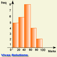
| 0 - 20 | 5 | 100 | 20 |
| 21 - 40 | 6 | 120 | 20 |
| 41 - 60 | 8 | 160 | 20 |
| 61 - 80 | 4 | 80 | 20 |
| 81 - 100 | 2 | 40 | 20 |
Since the area is proportional to the frequency - shown by the last column - this data can make a proper histogram as follows:

Now look at the following set of data
E.g.2
Marks obtained for maths in a certain class is as follows:
| Classes of Marks | Frequency | Area of Bar | Area of Bar / Frequency |
|---|
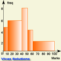
| 0 - 10 | 5 | 50 | 10 |
| 11 - 40 | 6 | 180 | 30 |
| 41 - 50 | 8 | 80 | 10 |
| 51 - 65 | 4 | 20 | 5 |
| 66 - 100 | 2 | 70 | 35 |
It is obvious that the area of a bar is not proportional to the frequency; therefore, this data, as it is, will not make a proper histogram - it is just a bar chart, that is misleading. The following diagram shows
it.

Check the tallest column - it has not got the highest frequency. That is why this graph, when considered as shown, is misleading.
To get round this problem - area being not proportional to the frequency, when class widths are not the same - we define a new term. It is frequency density
Frequency Density = Frequency / Class Width
Now, let's change the data table in the above example with frequency density.
| Classes of Marks | Frequency | Frequency Density | Area of Bar | Area of Bar / Frequency |
|---|
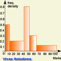
| 0 - 10 | 5 | 0.5 | 5 | 1 |
| 11 - 40 | 6 | 0.2 | 6 | 1 |
| 41 - 50 | 8 | 0.8 | 8 | 1 |
| 51 - 65 | 4 | 0.3 | 4 | 1 |
| 66 - 100 | 2 | 0.06 | 2 | 1 |
The introduction of the term, frequency density, has got round the problem; therefore, if the widths of classes are not equal, we must use frequency density, instead of frequency in dealing with
histograms. The following histograms shows all that.

Check the tallest column - it now represents the highest frequency; this graph, when considered as shown, is the right one.
E.g.3
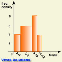
Look at the following histogram and then fill in the blanks of the table. It is about the performance ratings of a group of professionals.

| Classes of Marks | Frequency |
| 2 - 4 | thgie |
| 5 - 8 | neethgie |
| 9 - 10 | thgie |
| 11 - 12 | rouf |
Interactive Practice
The daily rainfall in a certain tropical region is shown in the following histogram: the data has been collected for 25 days; you can see the frequency, frequency density and raw data in the following applet.
The data is confined to five classes or bars. It also shows that Frequency density = Frequency / class width.
Work out the following questions:
Draw histograms for the following:
-
| Waiting time for a cashier at a bank in minutes | Frequency |
| 2 - 4 | 5 |
| 5 - 7 | 6 |
| 7 - 9 | 8 |
| 10 - 12 | 4 |
-
| Price of a crisp packet in pence | Frequency |
| 20 - 50 | 15 |
| 61 - 70 | 6 |
| 71 - 75 | 38 |
| 76 - 100 | 14 |